
Burt’s Bees
Burt’s Bees Honey Lips Packaging Redesign
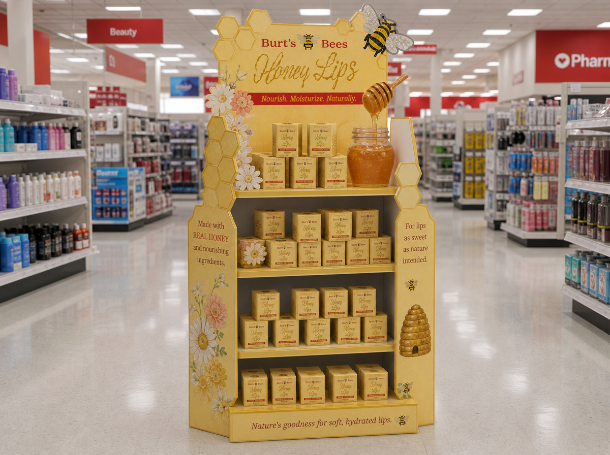
The goal was to make Burt’s Bees lip care feel more giftable, playful, and connected to the ingredient at the heart of the brand: honey.
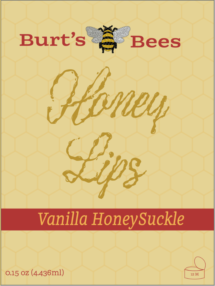
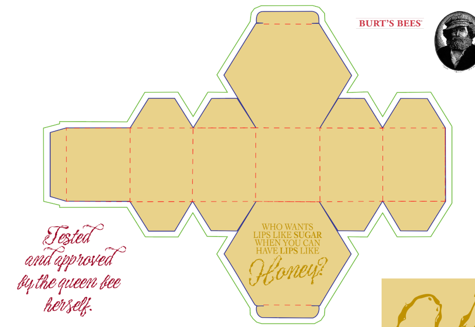
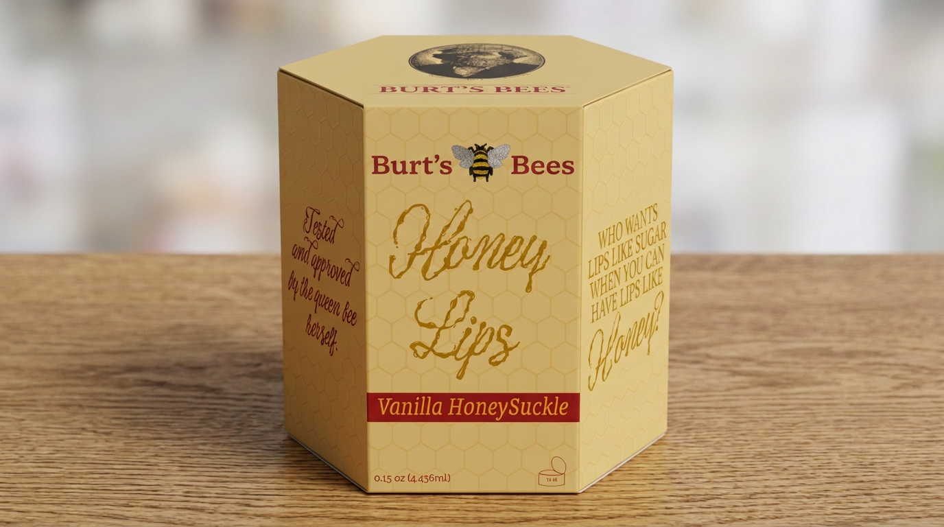
The hexagonal packaging draws inspiration from the structure of a honeycomb, while the warm yellow palette, subtle hive pattern, and hand-drawn typography create a natural, handcrafted feel. The copy plays into the idea of irresistibly sweet lips, giving the packaging a playful personality that feels more expressive than traditional lip balm.
Flavor cues like Vanilla Honeysuckle add to the sensory experience, making the product feel less like an everyday essential and more like a little indulgence.
CW: Natasha Badal
AD: Ashley Myles
